Portfolio Details-
Case Study: Garnier Nutritioniste — Ultra Lift & Skin Renew Packaging
Project information
- Category: Packaging
- Client: Garnier
- Project URL: www.garnier.com
Case Study: Garnier Nutritioniste — Ultra Lift & Skin Renew Packaging
Role: Production/ Designer
Project Type: Consumer Packaged Goods (CPG) / Skincare Packaging
Project Overview
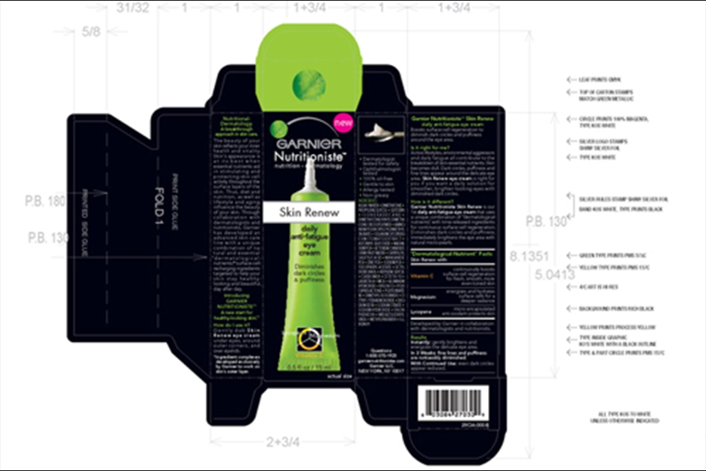
This project involved designing two complete carton mechanicals for Garnier Nutritioniste’s Ultra Lift and Skin Renew skincare products. Each mechanical includes full dielines, fold lines, measurements, ingredient panels, usage directions, marketing claims, and barcode placement. The designs follow Garnier’s signature green and black brand palette with red and yellow accents for product differentiation. Both cartons were built to be print ready, compliant with cosmetic labeling standards, and visually aligned as part of the same product family.
Problem
Skincare packaging must balance: • Clear communication of product benefits • Strong shelf presence • Regulatory compliance • Ingredient transparency • Brand consistency across multiple SKUs The challenge was to create two distinct cartons — Ultra Lift and Skin Renew — that feel unique yet unified within the Garnier Nutritioniste line.
Solution
I used a stark, close up portrait to create immediate emotional connection. The headline — “Bobby gets his looks from his father.” — delivers a chilling double meaning that forces the viewer to confront the reality of abuse. The right side panel introduces the National Child Abuse Prevention message and CASA branding, grounding the emotional impact in a call for advocacy.
Before / After
• Shifted from general awareness messaging to direct emotional storytelling
• Used a confronting portrait to create immediate empathy
• Crafted a headline that communicates the issue through implication rather than graphic detail
• Balanced emotional impact with clear organizational branding
• Reinforced advocacy through color, tone, and layout
Process
Working directly from the mechanicals, I ensured:
• Correct placement of product photography
• Accurate ingredient and direction panels
• Proper alignment of dielines and fold marks
• Consistent typography across both SKUs
• Clear hierarchy between brand, product name, and benefits
• Integration of marketing claims and usage instructions
• Barcode placement and manufacturing compliance
The mechanicals reflect both creative clarity and technical precision.
Tools
Photoshop Illustrator
Outcome
The final Ultra Lift and Skin Renew cartons deliver a polished, unified packaging system that strengthens Garnier Nutritioniste’s shelf presence. The combination of structured layout, clear messaging, and accurate mechanical formatting creates a professional, production ready result — a standout addition to your microsite’s skincare and beauty packaging category.