Portfolio Details- Case Study:
Duncan Hines — Whole Grain Muffin Mix
Project information
- Category: Advertising
- Client: Duncan Hines
- Project date: 01 March, 2024
- Project URL: www.duncanhines.com
Case Study: Duncan Hines — Whole Grain Muffin Mix Packaging
Role: Designer/ Print Production/ Mechanical Preperation
Project Type: Consumer Packaged Goods (CPG) / Packaging Design
Project Overview
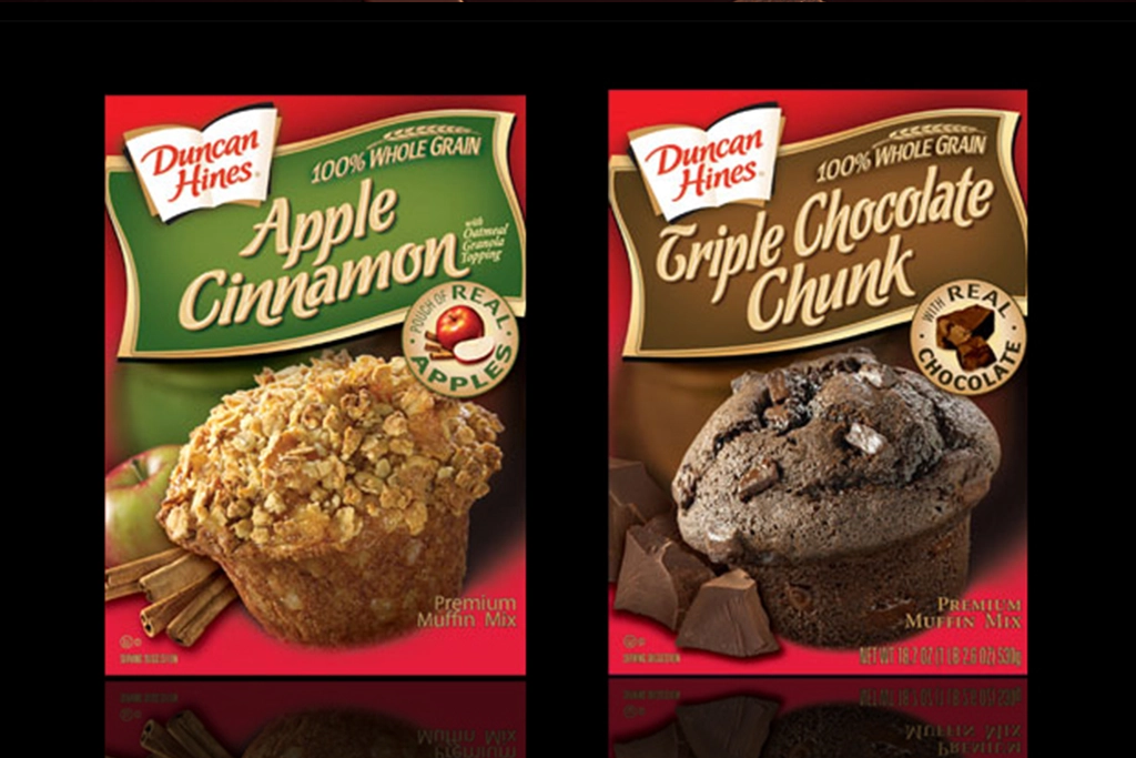
This project involved designing and refining the full packaging mechanicals for two Duncan Hines Whole Grain Premium Muffin Mix SKUs: Triple Chocolate Chunk and Apple Cinnamon with Oatmeal Crumble Topping. The goal was to create a unified visual system that communicates flavor, quality, and ease of preparation while meeting strict CPG production requirements.
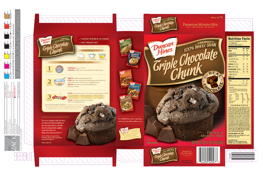
Both mechanicals include full nutrition panels, ingredient lists, cooking instructions, dielines, Pantone color specifications, and production notes — forming a complete packaging system ready for offset printing.
Problem
Duncan Hines needed packaging that: • Clearly differentiated flavors • Highlighted whole grain benefits • Communicated “premium” quality • Followed strict FDA labeling requirements • Worked across multiple sizes (jumbo, medium, mini muffins) • Printed accurately using Pantone based offset production The challenge was balancing appetite appeal, regulatory accuracy, and manufacturing precision within a single packaging system.
Solution
I developed a unified packaging structure with consistent hierarchy, color coding, and layout. Each SKU features:
Before / After
- Shifted from single SKU packaging to a unified multi SKU system
- Introduced consistent hierarchy across flavors
- Improved appetite appeal through refined photography and layout
- Strengthened whole grain positioning
- Added clear cooking instructions and serving suggestions
- Ensured FDA compliant nutrition and ingredient formatting
- Delivered print ready mechanicals with Pantone specifications
Process
- I worked directly from the mechanical documents, ensuring:
The mechanicals include production notes such as: “Use PANTONE MATCHING SYSTEM for an accurate color representation.” “We have checked this artwork for accuracy. Please check for errors before reproduction.” These were preserved and integrated into the final print ready files.
Tools Photoshop, Illustrator
Outcome
- The final packaging system delivers: